From the original article on November 20, 2021. Author: eugyppius.
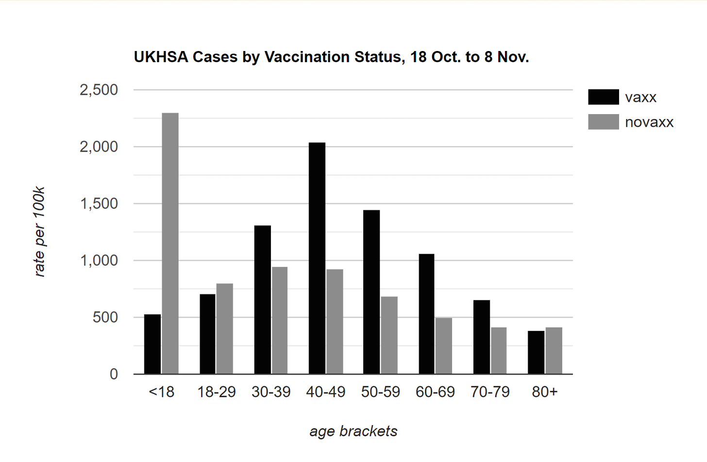
Developments in Austria delayed our weekly UK Health Security Agency negative efficacy update. Here’s the graph of cases by vaccination status for week 46:
And here are the 60-day death rates, by vaccination status:
Compare these to the 60-day raw death numbers, by vaccination status:
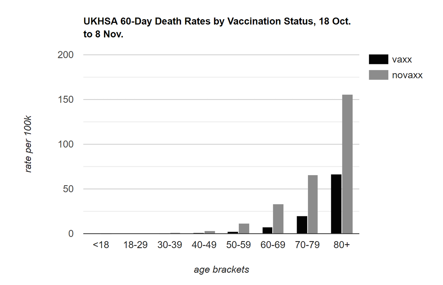
The vast majority of deaths are in the vaccinated. I will never tire of typing that Corona mortality risk is highly concentrated in the very old and the very sick. Most people—even most 80 year-olds—are not all that likely to die of Corona. If you can get vaccines to the greater part of the oldest and the sickest, your efficacy statistics will look more like those provided by the UKHSA. If you do a bad job of getting vaccines to the oldest and the sickest, you’ll end up with a far greater proportion of deaths in the unvaccinated.
T. Coddington, creator of many useful Corona dashboards, provides a special dashboard to visually explore the evolution of the UKHSA vaccine surveillance statistics over time. Explore it here.

Finally, a few readers forwarded me this wretched Reuters piece, purporting to debunk the Daily Sceptic and their (obviously true) observation that the UK Health Security Agency “purged” their vaccine surveillance reports “of the … chart showing infection rates higher in the double-vaccinated than the unvaccinated.”
The crack Reuters factcheckers, who are so proud of their high-level factchecking that they remain totally anonymous, declare this to be “false” because
the columns showing the rates … have not been removed, but moved elsewhere. They now appear in a table on page 20 … that compares the rates of infection, hospitalisation and death alongside each other.
This is next-level absurdity, even for the dubious enterprise of factchecking. Nobody is saying that the UKHSA removed the columns with the relative rates. We are saying that they removed the chart which illustrated the data in the columns. This is important, because humans are overtly visual creatures; raw numbers are good but harder to understand quickly, and they can’t be shared as easily. This is why I redraw the missing graph for you every week. Daily Sceptic are also very open about the fact that the data itself is still in the UKHSA reports. In the factchecked post they even use this data to continue their plot of the ongoing vaccine fade in Britain.
Library of Chadnet | wiki.chadnet.org